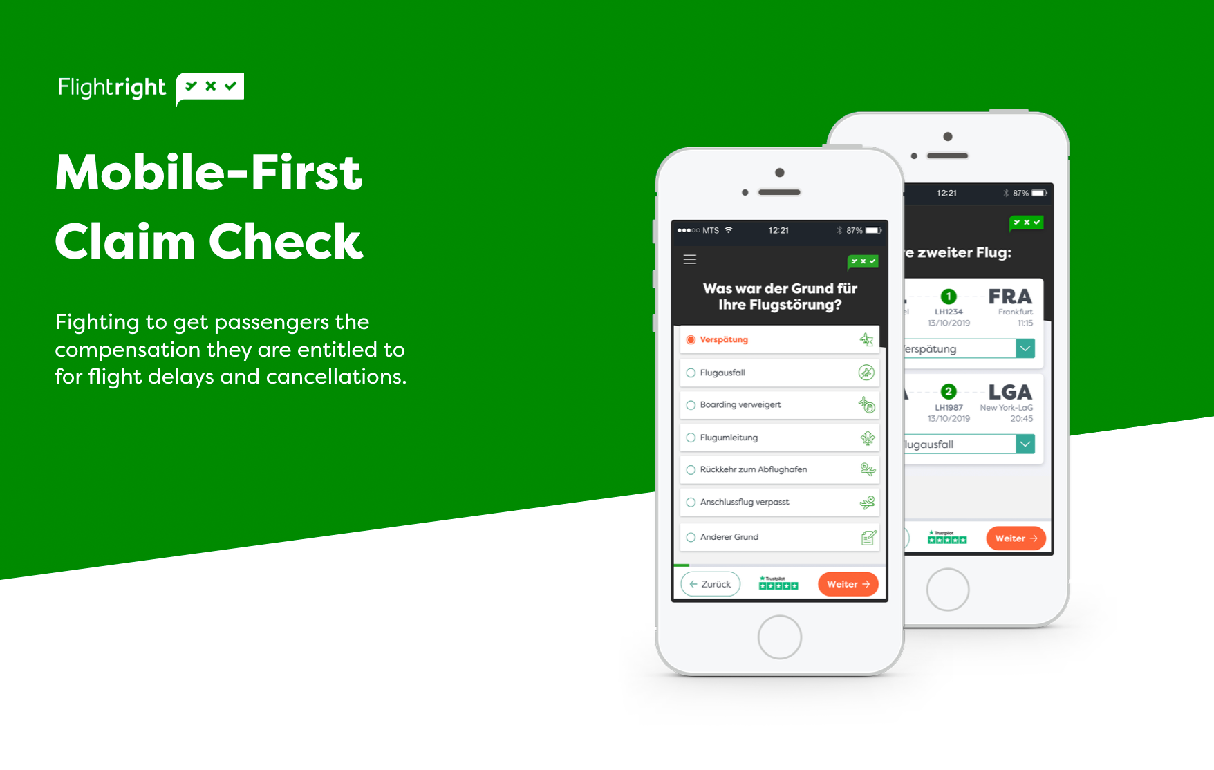
Who is Flightright and what do they do?
Flightright is Europe's leading air passenger rights portal, they provide an online calculator to check whether you are entitled to a flight delay compensation and then they enforce your claim at the touch of a button. Making justice accessible to everyone.
Flightright is Europe's leading air passenger rights portal, they provide an online calculator to check whether you are entitled to a flight delay compensation and then they enforce your claim at the touch of a button. Making justice accessible to everyone.
My beginning started in the middle
Flightright has an already established brand and product for almost 12 years and operates in several different European locations.
Flightright has an already established brand and product for almost 12 years and operates in several different European locations.
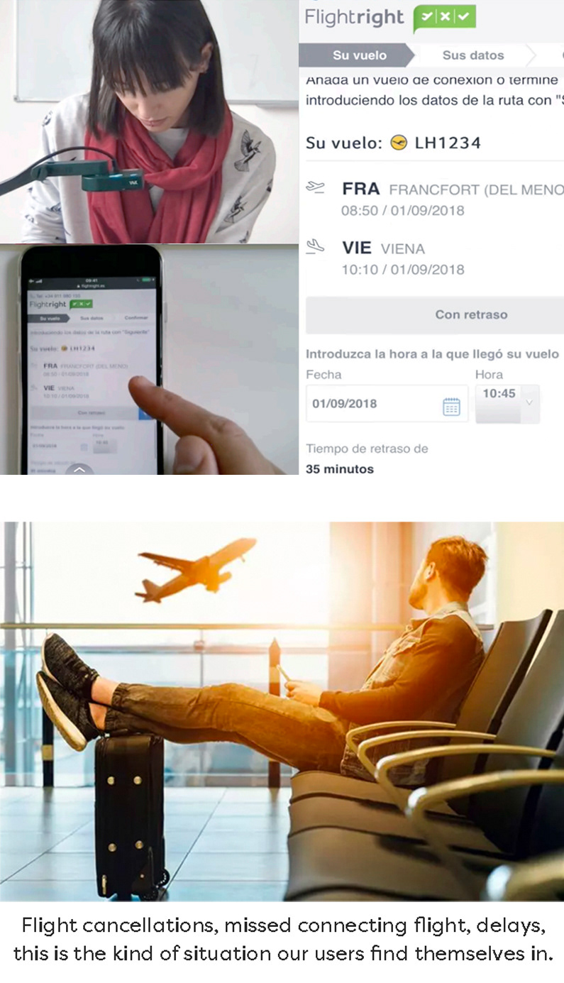
During my first week at Flightright I was asked to do user testing on the Spanish website to try to discover why the conversion rates were so low.
User testing comes a bit later in the UCD approach. So before beginning user testing I got up to speed with the previous steps my new teammates had already completed. This is when we discovered something that would spark a whole new redo of the product with a mobile-first approach.

If you just need a quick snapshot of this project - keep reading
If you would like an indepth look at my research and process - click here

EXISTING RESEARCH:
+ Personas
+ User Scenarios
+ Process Flows
+ User Journey Maps
+ Google Analytics
+ Hot Jar screen recordings
+ User Testing (on desktop)
+ Personas
+ User Scenarios
+ Process Flows
+ User Journey Maps
+ Google Analytics
+ Hot Jar screen recordings
+ User Testing (on desktop)
MY USER RESEARCH CONTRIBUTION:
+ Content Audit
+ Competitor Analysis
+ Site Map
+ Stakeholder Interviews
+ Wireframing
+ Prototyping
+ User Testing (on mobile)
+ Content Audit
+ Competitor Analysis
+ Site Map
+ Stakeholder Interviews
+ Wireframing
+ Prototyping
+ User Testing (on mobile)
INTERESTING FINDINGS FROM MY RESEARCH - red flags:
Google analytics showed that:
62% of users were on mobile devices
versus 33% on desktop
Google analytics showed that:
62% of users were on mobile devices
versus 33% on desktop
but the mobile conversion was less than half that of desktop.
I know these are common findings in digital products and services but I also know that this is often because the product or service has not been optimised for a mobile environment. Experts continuously say that studies and testing has shown:
People are not afraid to buy on their phone - they just do not want to work for it. Put another way, it is a matter of user experience.
When Flightright first launched its online compensation calculator in 2010 most mobile phones looked like the ones in the image. Users weren't doing important tasks on their phones, so the Flighright website was built with a desktop first approach and never adapted to today's mobile dominated environment.
I could go into it a bit more but that right there is the nuts and bolts of the problem.
After some stakeholder interviews I realised people were kind of aware of the problem but there were a lot of assumptions being made, for example - "people prefer to do important things on their desktop".

GOAL - problem discovery:
Discover pain points/UX issues on mobile devices
What is clear & what is confusing
Do people prefer to do a claim on desktop or mobile?
Discover pain points/UX issues on mobile devices
What is clear & what is confusing
Do people prefer to do a claim on desktop or mobile?
SPECIFICATIONS:
+ Moderated onsite with scenario & task based test, & think aloud protocol
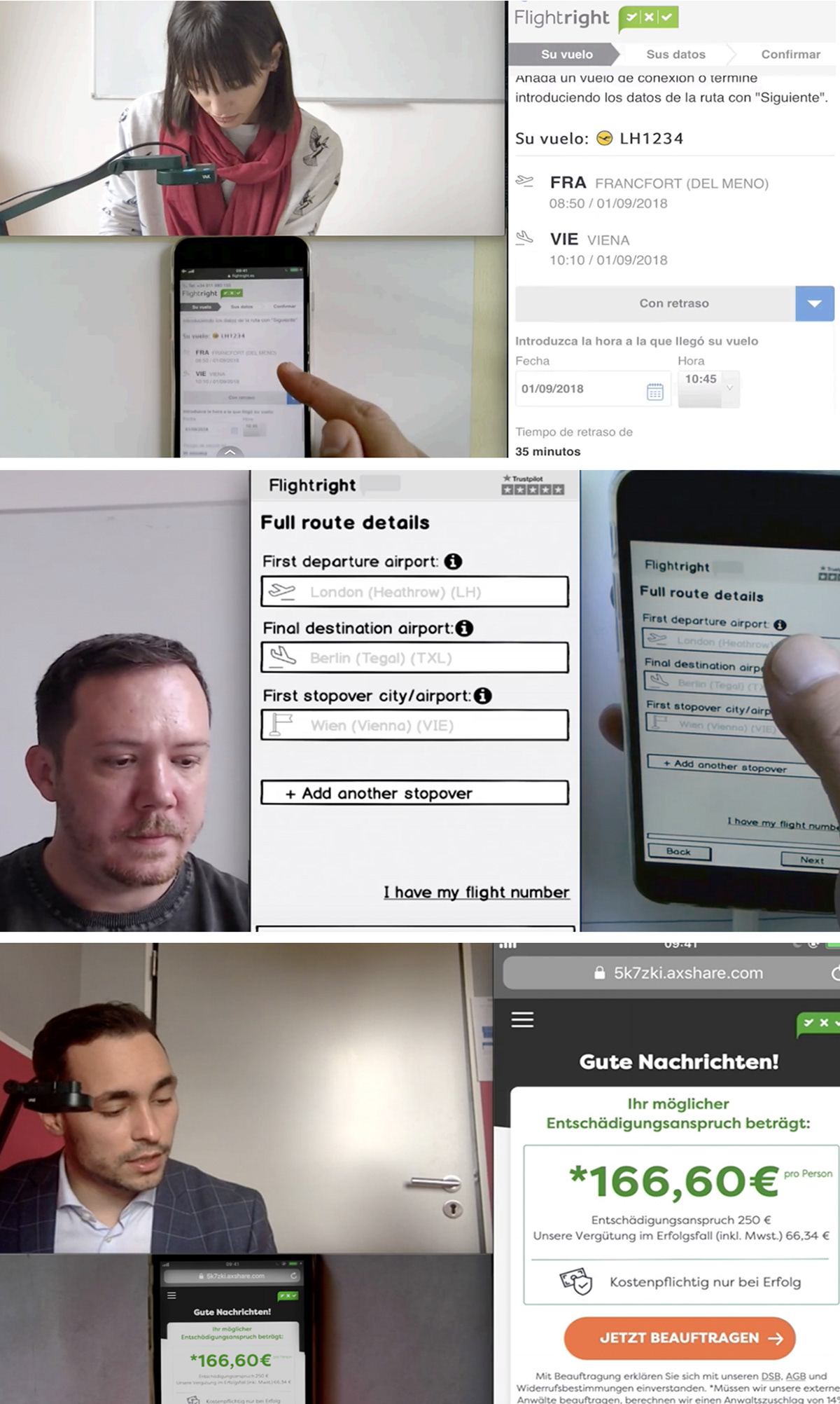
+ Tested on a Mobile Device with live website
+ Capture 3 different angles of the participant; facial expressions, hand gestures and mobile screen.
+ 5 Participants, Agency to screen participants who fit our target audience. Since one of the goals of usability testing is to get inside the minds of your users, I put effort into sourcing participants that represented the demographics of Flightright users.
+ Moderated onsite with scenario & task based test, & think aloud protocol
+ Tested on a Mobile Device with live website
+ Capture 3 different angles of the participant; facial expressions, hand gestures and mobile screen.
+ 5 Participants, Agency to screen participants who fit our target audience. Since one of the goals of usability testing is to get inside the minds of your users, I put effort into sourcing participants that represented the demographics of Flightright users.
All prior user testing at Flightright had been conducted on a desktop. This was the first time mobile devices would be used instead. We invested in some new tech to record users hand gestures whilst completing the tasks.
RESULTS:
+ The mobile experience is confusing, clumsy and often broken
+ The CTA’s, info tips and main questions were often below the fold
+ Users get rejected claims from unknowingly entering wrong information
+ Users left before completing the claim incorrectly thinking they had finished the task
RESULTS:
+ The mobile experience is confusing, clumsy and often broken
+ The CTA’s, info tips and main questions were often below the fold
+ Users get rejected claims from unknowingly entering wrong information
+ Users left before completing the claim incorrectly thinking they had finished the task
What I found really interesting about the results is that they were specific only to mobile devices. From previous testing on a desktop with similar test/scenario/tasks - the pain points are dramatically reduced and were different than that on Mobile. Not great if 62% of your users are on Mobile Devices.
I was asked to present my findings to C level management then in the following days the unanimous decision was made to redo our claim check with a mobile first approach.

+ Redesign with a mobile first approach
+ Simplify the user flow so entering a case is easier on mobile devices
+ Update UI to match the new branding and landing page
+ Increase conversion on Mobile to 3%
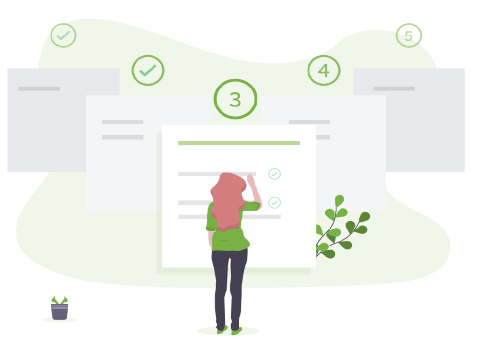
INFORMATION ARCHITECTURE & WIREFRAMING
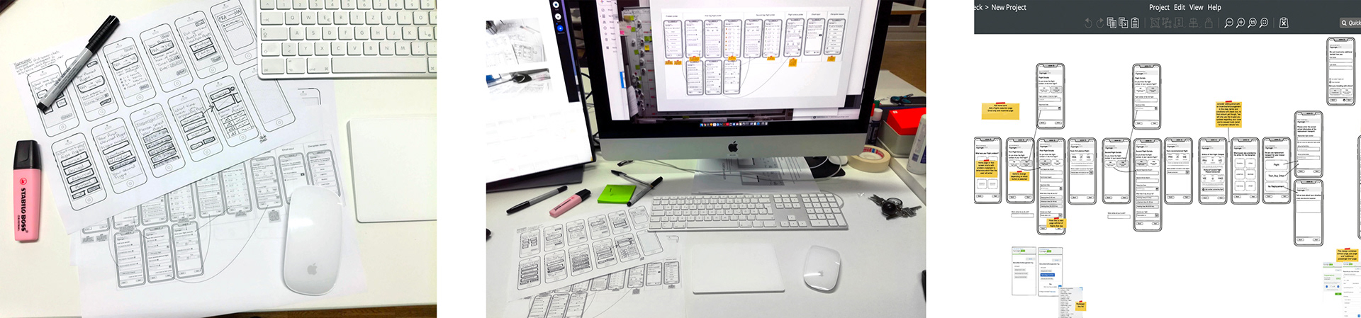
Based on research and previous user testing we knew we needed to simplify and reorganise the user flow so that users can complete a claim check intuitively and effortlessly. I generated a few different ideas and solutions with some rapid sketches and wireframing then took the best of those ideas into Balsamiq for some wireframe usability testing.
Based on research and previous user testing we knew we needed to simplify and reorganise the user flow so that users can complete a claim check intuitively and effortlessly. I generated a few different ideas and solutions with some rapid sketches and wireframing then took the best of those ideas into Balsamiq for some wireframe usability testing.

The user testing was conducted in 4 distinct phases:
Phase 1: Review current claim check to uncover pain points on mobile devices
Phase 2: Wireframe user testing with the first iteration of our solution before any styling to make sure we're headed in the right direction
Phase 3: Styling and UI user testing
Phase 4: User Testing the completed design
38 User testing interviews
9 Iterations
We’ve run a design sprint for every disputable case of main functionality.
Every session consisted of:
+ Generating ideas with rapid sketches
+ Reviewing, giving feedback and choosing best solutions
+ Fast prototyping in the Sketch App, Invision and Axure
+ Validating with users and improving flows
+ Generating ideas with rapid sketches
+ Reviewing, giving feedback and choosing best solutions
+ Fast prototyping in the Sketch App, Invision and Axure
+ Validating with users and improving flows
Here's part of my team doing an awkward reenactment of our daily standup (thanks guys)
VISUAL RESEARCH
When we finalized the information architecture and wireframes phase, the next step was to define the global style for the new design. Our tasks were to:
When we finalized the information architecture and wireframes phase, the next step was to define the global style for the new design. Our tasks were to:
+ Gather inspiring graphic assets for the moodboard
+ Set the colour palette for all UI elements
+ Define mobile typography rules
+ Design icon and illustration sets
+ Set the colour palette for all UI elements
+ Define mobile typography rules
+ Design icon and illustration sets
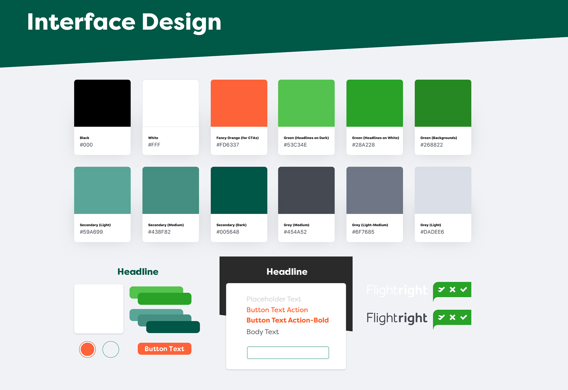
COLOUR PALETTE
For better colour management, we’ve prepared a set of predefined colours for all UI elements, including primary actions, grayscales, alerts, content types and others.
For better colour management, we’ve prepared a set of predefined colours for all UI elements, including primary actions, grayscales, alerts, content types and others.
TYPOGRAPHY
Perfectly presented content was one of our main goals. In this phase, we focused on matching font combinations, setting typographic hierarchy, testing multi-language support and defining text styles for mobile use.
Perfectly presented content was one of our main goals. In this phase, we focused on matching font combinations, setting typographic hierarchy, testing multi-language support and defining text styles for mobile use.
ICONS
At the very beginning, we’ve prepared a list of all required icons and placeholder illustrations. After that, we divided that list into categories according to size and location in the user flow. Afterward, we sketched our ideas on paper and designed a visual style in illustrator.
At the very beginning, we’ve prepared a list of all required icons and placeholder illustrations. After that, we divided that list into categories according to size and location in the user flow. Afterward, we sketched our ideas on paper and designed a visual style in illustrator.
When we had our visual style defined, we could jump into styling screens. We managed to keep the application consistent by using detailed style guide boards and keeping all objects in nested symbols.
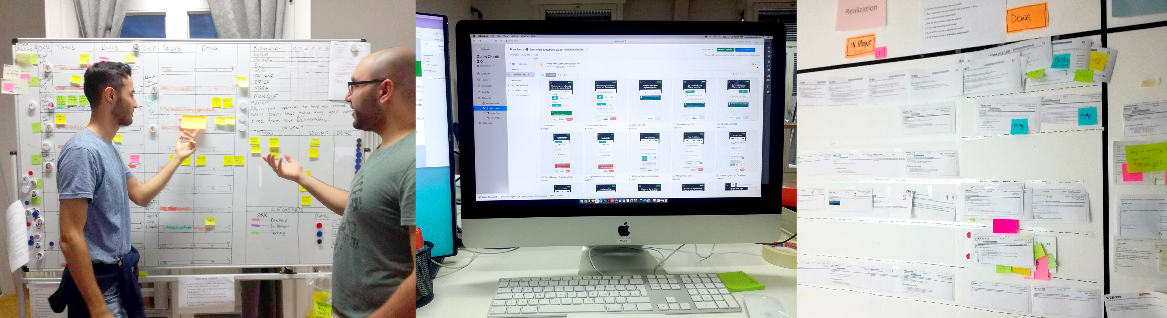
Part of our development team are based in Kiev so communication is important to us at Flightright.
We used Axure prototypes with detailed notes for regular stakeholder reviews and abstract guides for continuous development collaboration.
STYLE GUIDES
We found that the best way to improve designer-developer cooperation is to prepare style guides, based on the atomic design methodology. With this approach, maintaining product interface consistency is much easier for both developers and designers. Abstract was our main tool for this part of the project.
We found that the best way to improve designer-developer cooperation is to prepare style guides, based on the atomic design methodology. With this approach, maintaining product interface consistency is much easier for both developers and designers. Abstract was our main tool for this part of the project.
PROTOTYPES
For a better understanding of the final product in development process and in user testing phase, we created interactive prototypes in the Invision App. This was fine for the simple wireframe phase of user testing, but once we developed a more complex user flow we needed a more powerful prototyping tool so we switched to Axure which has been an amazing prototyping tool to work with.
For a better understanding of the final product in development process and in user testing phase, we created interactive prototypes in the Invision App. This was fine for the simple wireframe phase of user testing, but once we developed a more complex user flow we needed a more powerful prototyping tool so we switched to Axure which has been an amazing prototyping tool to work with.
We understand that beautifully designed screens are just screens. The important thing is how to transfer them to the real product. And there comes our designers-developers collaboration process.
SCRUM
For effective team collaboration in such a big project, we had to go agile. We used Scrum framework with two-week sprints, including planings, reviews and retrospectives.
For effective team collaboration in such a big project, we had to go agile. We used Scrum framework with two-week sprints, including planings, reviews and retrospectives.
DESIGN REVIEWS
To keep developers on the same track we had design review meetings on a weekly basis.
To keep developers on the same track we had design review meetings on a weekly basis.
QUALITY ASSURANCE
Finally, we had a dedicated team of quality assurance engineers to monitor the app status and report issues on a Jira system.
Finally, we had a dedicated team of quality assurance engineers to monitor the app status and report issues on a Jira system.
METRICS AND MEASUREMENT - "What is measured gets improved."
The launch of the new claim check has been delayed due to the impact of Covid-19 on the flight industry. Once it is launched we will be able to collect metrics data then continue refining the pain points as part of the agile process.
UX KPI's planned for this project:
Behavioral UX KPIs
Task success rate
Time-on-task
User error rate
Customer satisfaction (CSAT)
Behavioral UX KPIs
Task success rate
Time-on-task
User error rate
Customer satisfaction (CSAT)

The project development was mostly completed, including an entirely new tech stack using Vue.js, in early March of 2020 but unfortunately due the the COVID-19 Pandemic it was put on hold and never pushed live. The company as a whole pivoted to create a new product to help customers get their cancelled flight tickets refunded from the airlines during the crisis. The project is currently still on hold.