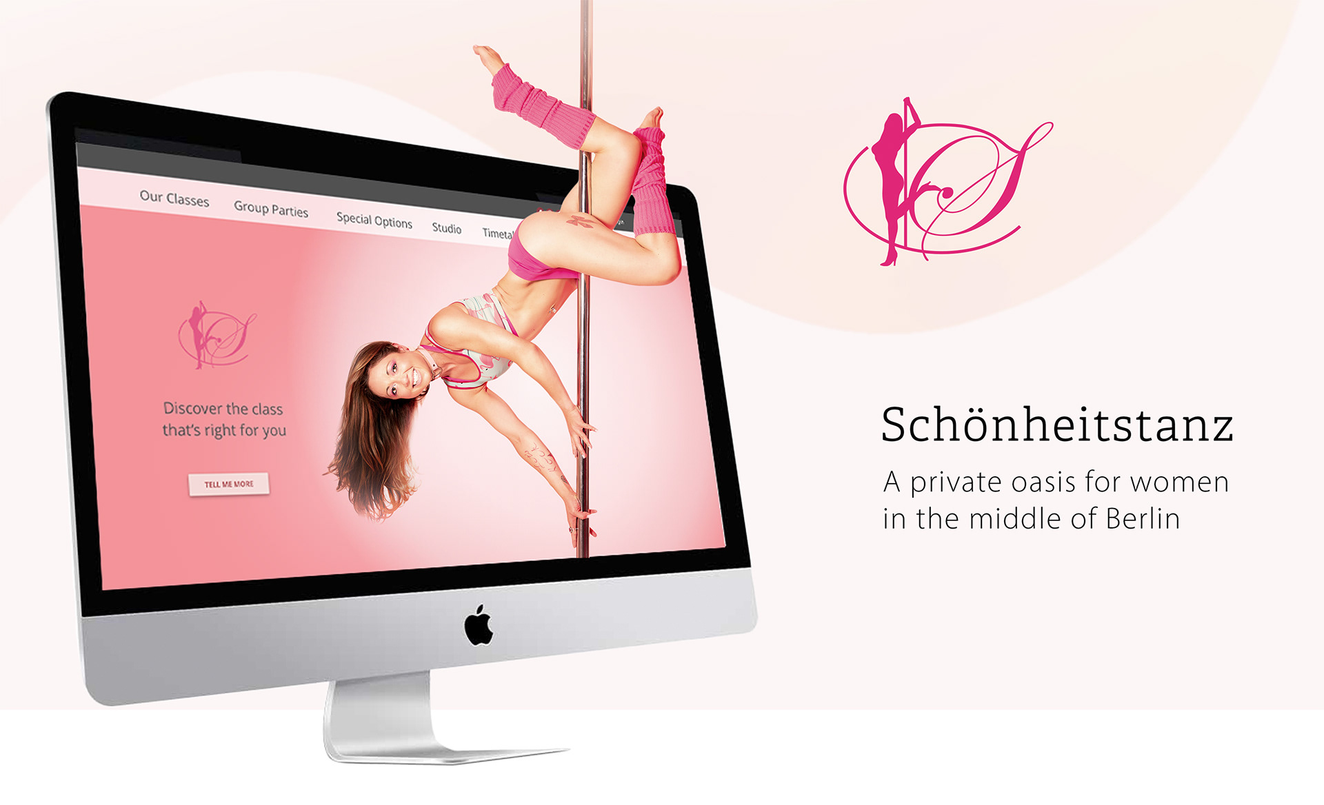
BACKGROUND
Schonheitstanz is a dance studio in Berlin that offers a wide variety of pole, burlesque, exotic, twerking and other dance related classes. Because of the wide range of services and class information it provides, the business was facing challenges with maintaining a user-friendly website. I was invited to work on the redesign of the website and collaborate with the Schonheitstanz website developer.
MY ROLE
Research, web data analysis, content strategy, information architecture, wireframes, prototyping, visual design
Research, web data analysis, content strategy, information architecture, wireframes, prototyping, visual design
TOOLS
Sketch App, Photoshop, Invision, Abstract, Balsamiq, Google Analytics, Hot Jar, Optimal Workshop.
Sketch App, Photoshop, Invision, Abstract, Balsamiq, Google Analytics, Hot Jar, Optimal Workshop.
CHALLENGE - The current experience
The website is the major channel for students, teachers and potential customers to find info on classes, events, and class timetables. However, the current website has severe usability problems that make it challenging for visitors to achieve their tasks quickly and accurately. Some major usability issues were:
The website is the major channel for students, teachers and potential customers to find info on classes, events, and class timetables. However, the current website has severe usability problems that make it challenging for visitors to achieve their tasks quickly and accurately. Some major usability issues were:
+ Disorganized and overwhelming content
+ Confusing IA and navigation
+ Lack of hierarchy and inconsistent CTA
+ Confusing IA and navigation
+ Lack of hierarchy and inconsistent CTA
USER RESEARCH
SURVEYS, INTERVIEWS, DATA ANALYSIS
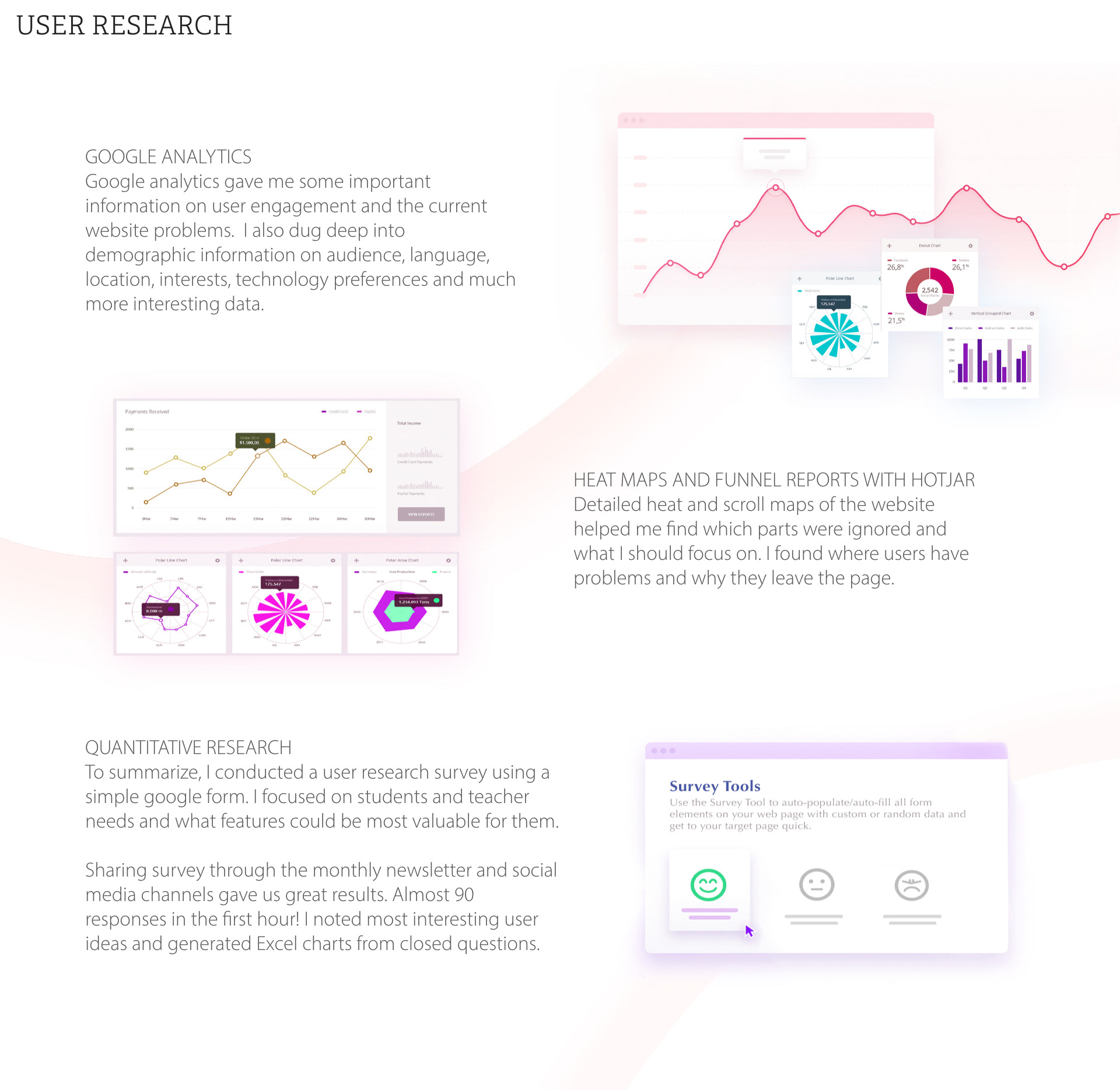
+ Google analytics
+ Hot Jar, Heat Maps and Funnel Reports
+ Quantitative research - newsletter survey
+ Google analytics
+ Hot Jar, Heat Maps and Funnel Reports
+ Quantitative research - newsletter survey
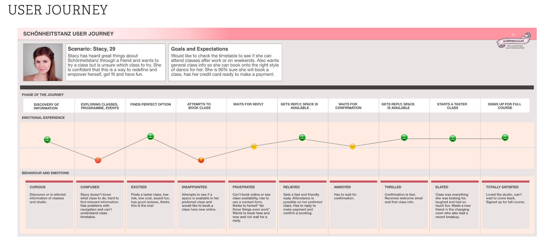
We were lucky the web platform was already configured with google analytics. My first move was an immediate jump into gathered data to analyze nearly 5 years of results. The newsletter survey revealed the urgent need for an online booking feature.
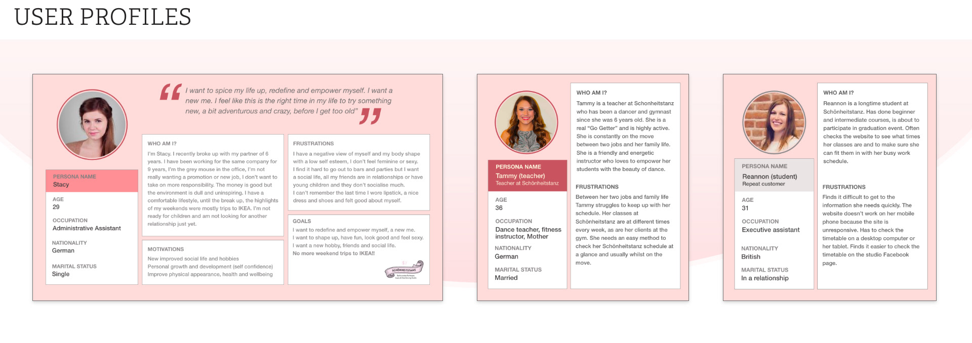
Understanding User Needs
Based on user behaviour, I determined three types of users and their primary use of the website. This helped me to prioritize pages so that I could redesign and discard pages that don't meet user's or the business needs and goals. I chose to include gender in the User Profiles because the studio is a female only environment.
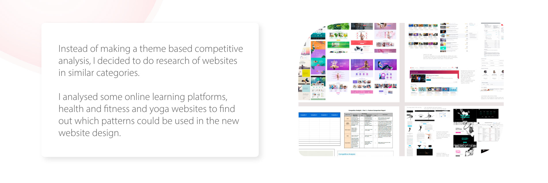
COMPETITIVE ANALYSIS & CONTENT AUDIT
I conducted a content audit and placed the info into a spreadsheet, helping me to understand the current content of the website. I also conducted competitor research on the main competitors in order to understand how others are solving class info and timetable presentation problems and booking features. A lot of Dance studios have their own websites but most of them exist only for information purposes, a few have online booking features. Most of the ones I came across had the same issues that Schonheitstanz was trying to overcome.
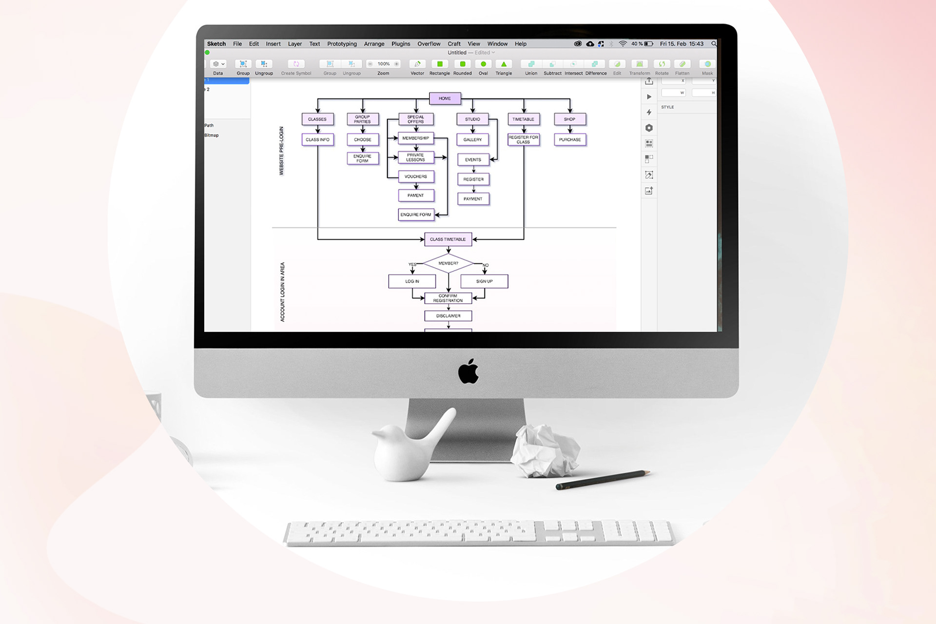
INFORMATION ARCHITECTURE
Based on research I knew I needed to simplify and reorganise the navigation structure so that the users can find the content intuitively and effortlessly.
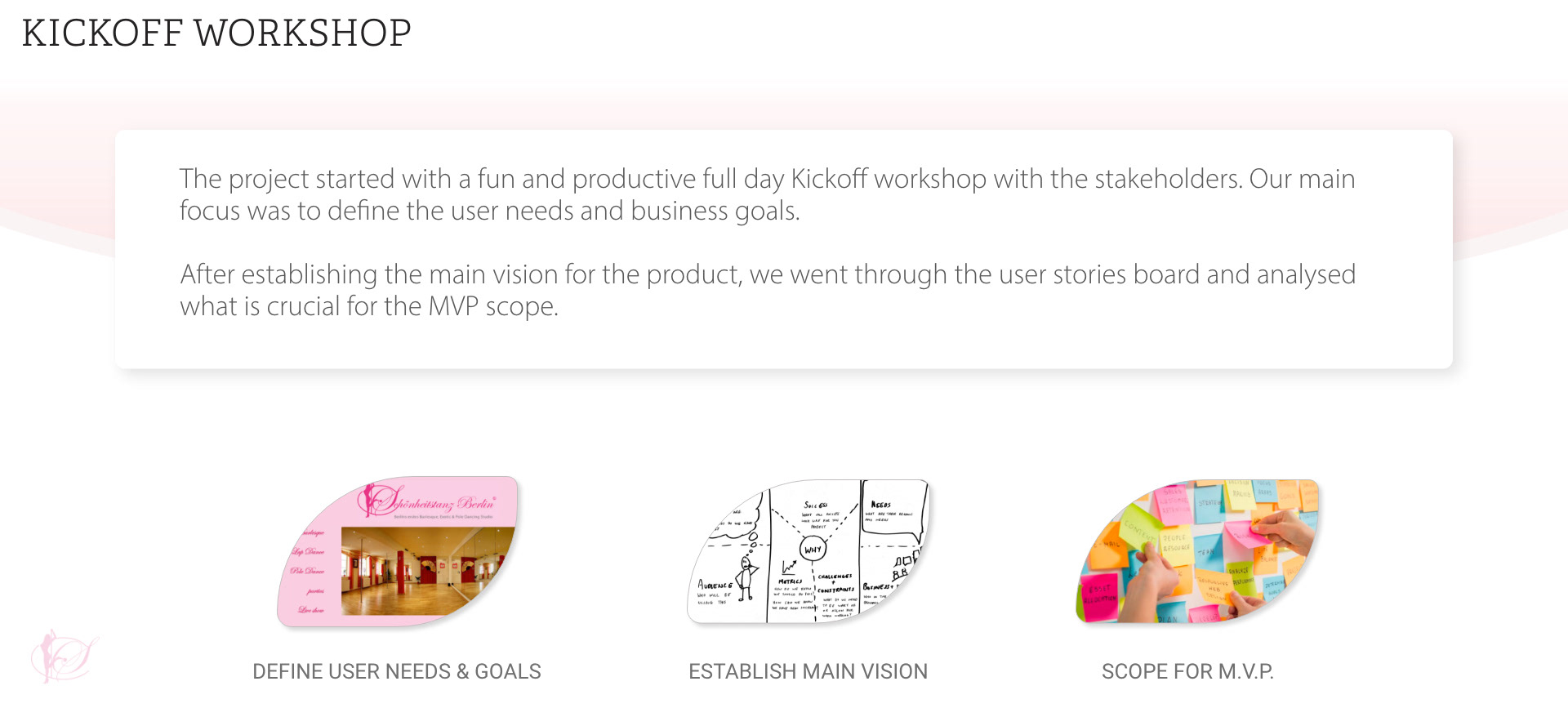
Firstly I established the critical paths to value in the form of a user task flow map. This helped me identify what needed to be included in the navigation to provide value for users AND for the business.
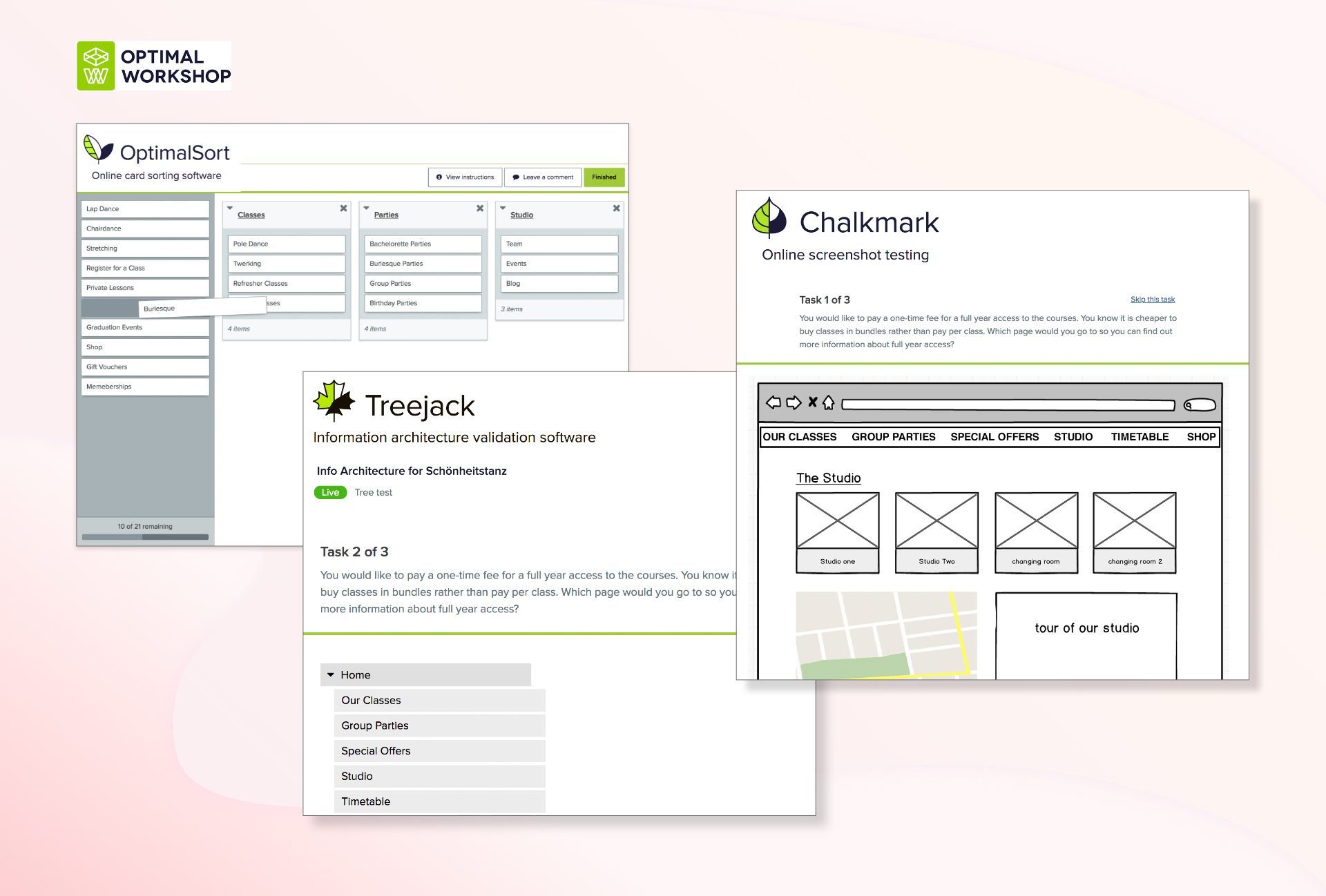
Next I generated five different ideas and solutions with some post it notes and rapid sketches in my notebook then took the best of those ideas into Optimal Workshop (a suite of usability testing tools) for some usability testing.
USABILITY TESTING
Since one of the goals of usability testing is to get inside the minds of the users you design for, I put effort into sourcing participants that represented the demographics of Schonheitstanz users. They were then asked to participate in one of the following methods:
Card Sorting:
I used Optimal Workshops online card sorting tool, participants were asked to sort the cards into groups that made sense to them. I found it to be helpful for finding patterns on how users would expect to find content. From this exercise I generated new ideas on how to group or label the content.
I used Optimal Workshops online card sorting tool, participants were asked to sort the cards into groups that made sense to them. I found it to be helpful for finding patterns on how users would expect to find content. From this exercise I generated new ideas on how to group or label the content.
Tree testing:
I found Tree Testing particularly helpful as it allowed me to present a menu structure to users in its most basic form without worrying about the layout and design.
This helped me to:
+ Discover why and where people got lost in the content
+ Determined quickly if the labels and structure, taxonomies etc are easy to understand.
+ Gave me an instant insight into what was working and what was not.
First Click Testing:
After a few rounds of iteration I used some low fidelity wireframes to confirm people can find what they came to the website for. First Click testing with Chalkmark is like remote user testing with wireframes, I could read the results with heat maps and click density grids.
After a few rounds of iteration I used some low fidelity wireframes to confirm people can find what they came to the website for. First Click testing with Chalkmark is like remote user testing with wireframes, I could read the results with heat maps and click density grids.
After iterating different solutions and user testing I constructed a simpler IA by decreasing the main navigation categories from 16 to 6. To avoid creating unnecessary cognitive and visual competition I implemented a Dual Navigation Menu. This is what I took into consideration when building the navigation scheme:
PRIMARY NAVIGATION:
+ What people care about the most
+ Content most visitors are looking for, why they are here
+ The core thing the business is selling/providing
+ What people care about the most
+ Content most visitors are looking for, why they are here
+ The core thing the business is selling/providing
SECONDARY NAVIGATION:
+ Useful but not as important
+ Doesn't serve primary goal
+ Useful but not as important
+ Doesn't serve primary goal
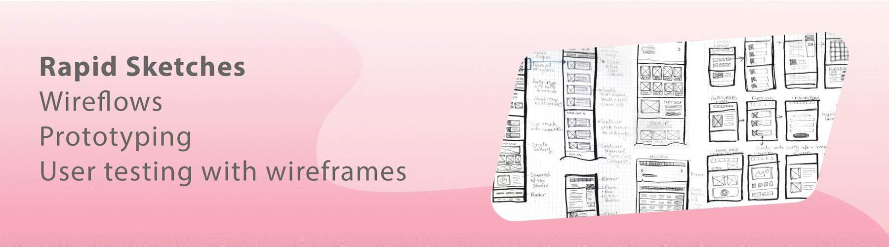
WIREFRAMING
After establishing how the content was to be grouped I moved onto wire framing which was comprised of a few different phases:
+ rapid sketches & wireflows to find out ideas and solutions
+ digital wireframes for prototype tests
+ prototyping with Adobe XD and Invision
+ validating with users and improving flows
+ rapid sketches & wireflows to find out ideas and solutions
+ digital wireframes for prototype tests
+ prototyping with Adobe XD and Invision
+ validating with users and improving flows
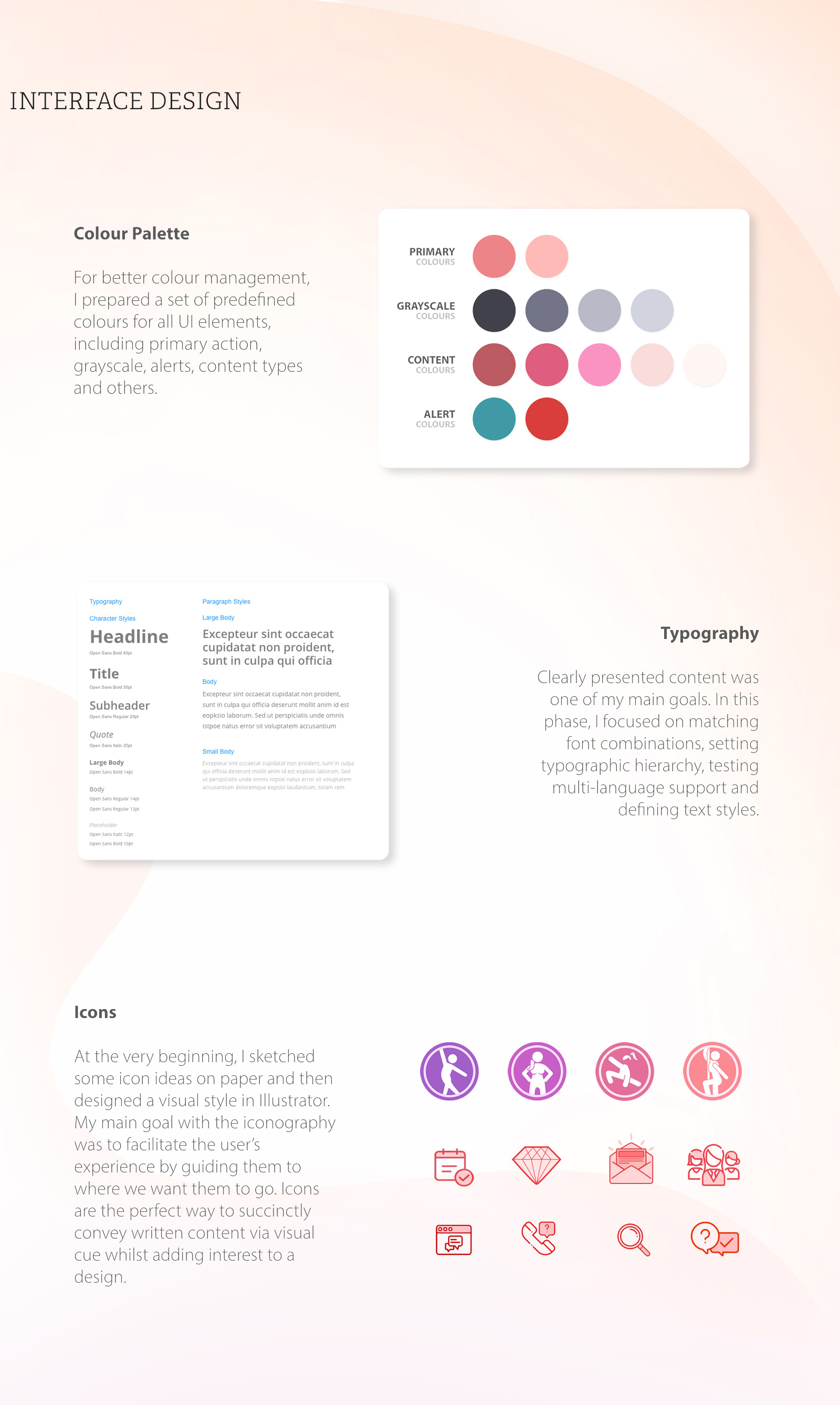
VISUAL RESEARCH
When I finalised the information architecture and wireframes phase, the next step was to define the global style for the new website. This included:
+ Gathering inspiring graphics for the mood board
+ Setting the colour palette for all UI elements
+ Defining typography rules
+ Design icons and illustration sets
+ Setting the colour palette for all UI elements
+ Defining typography rules
+ Design icons and illustration sets
INTERFACE DESIGN
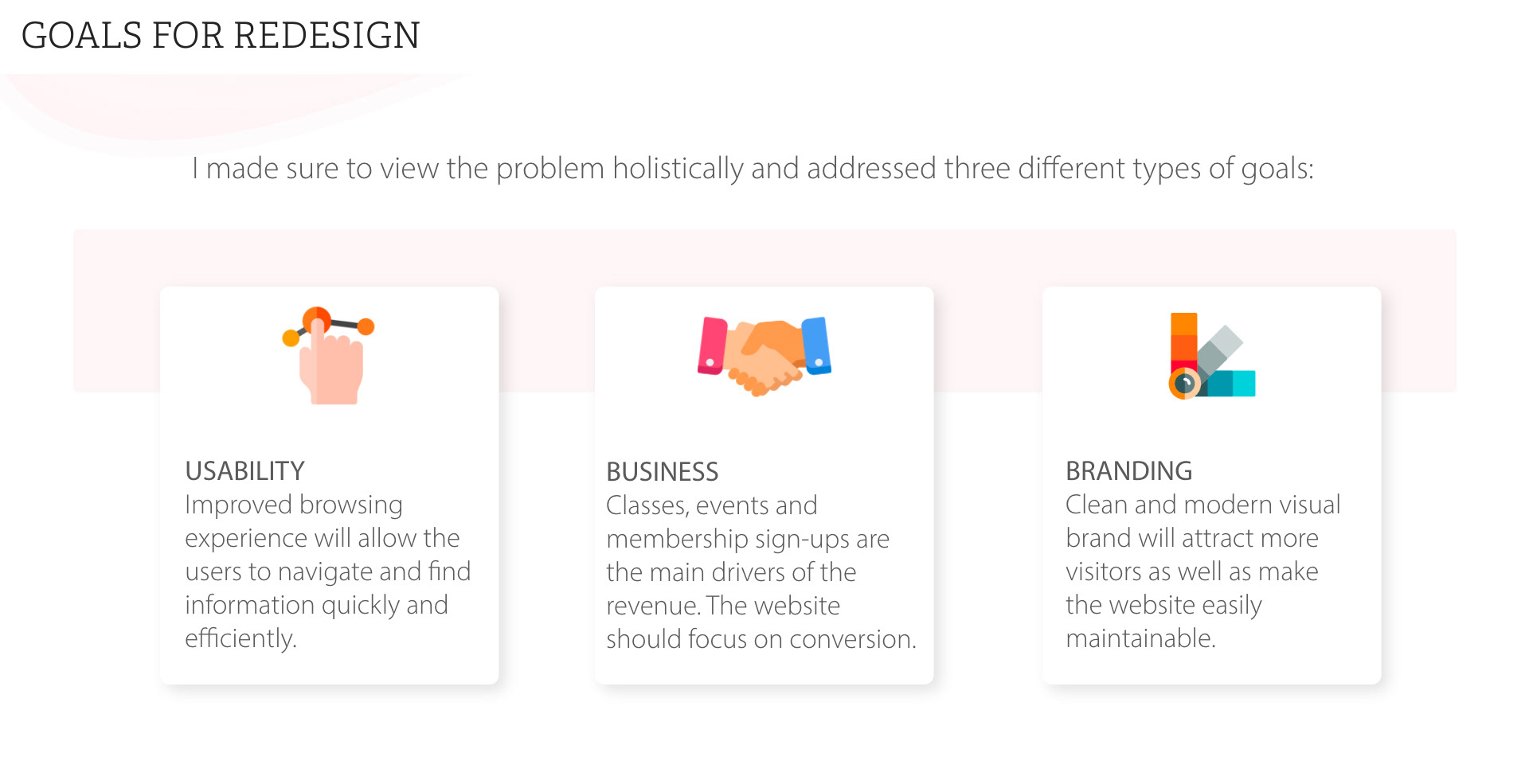
One of the primary goals of this project was IMPROVE USABILITY.
Improve browsing experience to allow users to navigate and find information quickly and efficiently.
To organize information in an easily digestible way, I implemented the use of Card design. Cards organize information into chunks of content, and users appreciate chunked content because it aids for scannability: it helps avoid walls of text, which can appear intimidating or time-consuming and allows users to dive deep into their interests quicker. Cards serve as entry points to more detailed information.
Final Mockups:
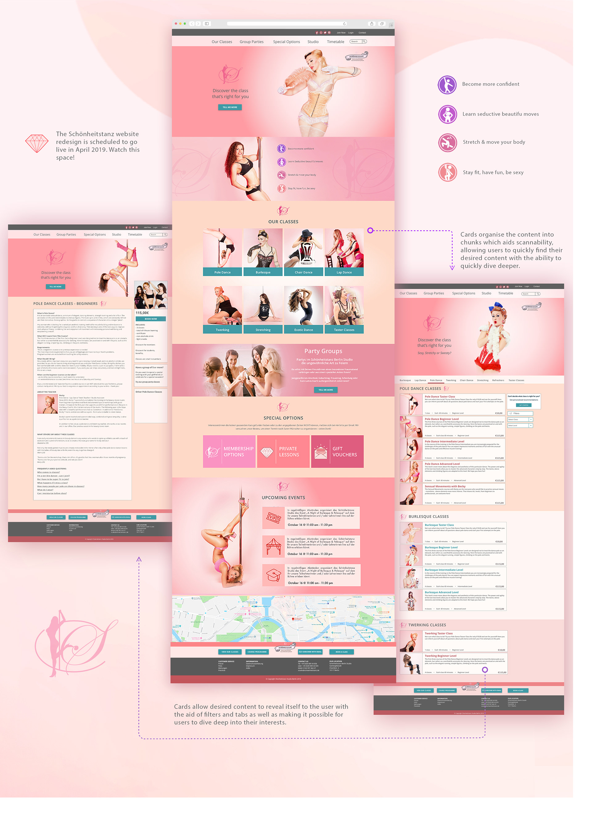
This project is in development will go live in August 2020. The outdated website can be viewed here www.schoenheitstanz.de/berlin/
What I learned from this project.
RESEARCH IS IMPORTANT
In most UX projects this goes without saying, but here it gained even more importance. The user research survey revealed unexpected information and made it possible to adapt the product to users’ needs.
In most UX projects this goes without saying, but here it gained even more importance. The user research survey revealed unexpected information and made it possible to adapt the product to users’ needs.
Conducting user testing and evaluating users feedback at various stages helped me to discover and eliminate pain points at early stages.
Collaborate more with others! I worked on this project alone, at times I could have problem solved and stayed on track better with someone to bounce ideas off.