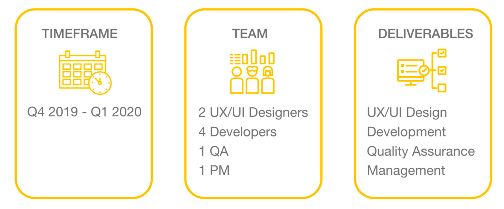
This was a freelance project with a remote product team including one other UX/UI designer. I was involved mostly in the User Interface design rather than UX. This product is still in development so the business name has been changed and some details have been left out.
BUSINESS BACKGROUND
State magazine already has a successful health and fitness magazine read mostly by men. However, they realized a lot of women read their health and fitness related content, so they decided to create a new online product for men AND women accompanied by an app where users can contact influencers for advice, tips etc.
MY ROLE
When I joined the team a lot of the UX research had already been done. The user goals, MVP and project scope had already been established. The other UX designer on our team had done some user research.
Existing research:
+ User journeys
+ Competitor analysis
+ Brand personas
+ Market segment personas
+ Design Thinking/ kickoff workshop
Existing research:
+ User journeys
+ Competitor analysis
+ Brand personas
+ Market segment personas
+ Design Thinking/ kickoff workshop
My contribution:
+ Information Architecture
+ Wireframing/Prototyping
+ User Testing
+ Visual Design/Interaction Design
+ Design System
+ Information Architecture
+ Wireframing/Prototyping
+ User Testing
+ Visual Design/Interaction Design
+ Design System
The user personas had purposely been left out and the opinion was that they create too much bias.
In my past experience of UI design (when I'm not part of the UX process) I find that user personas or user stories/scenarios helped make the audience memorable, focus my design efforts and build empathy. Good user personas are based on research and can take time. I unfortunately wasn't allocated any time for this task so had to continue and make do with the information that I had.
Before I joined the team a design thinking workshop was held to explore potential solutions, challenge assumptions and to think outside the box. The team established a clear idea of which problem we were trying to solve for the user and defined a clear problem statement with a "How might we" question.
Before I joined the team a design thinking workshop was held to explore potential solutions, challenge assumptions and to think outside the box. The team established a clear idea of which problem we were trying to solve for the user and defined a clear problem statement with a "How might we" question.
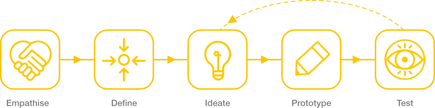
This project followed the five stages of the Design Thinking Process
INFORMATION ARCHITECTURE
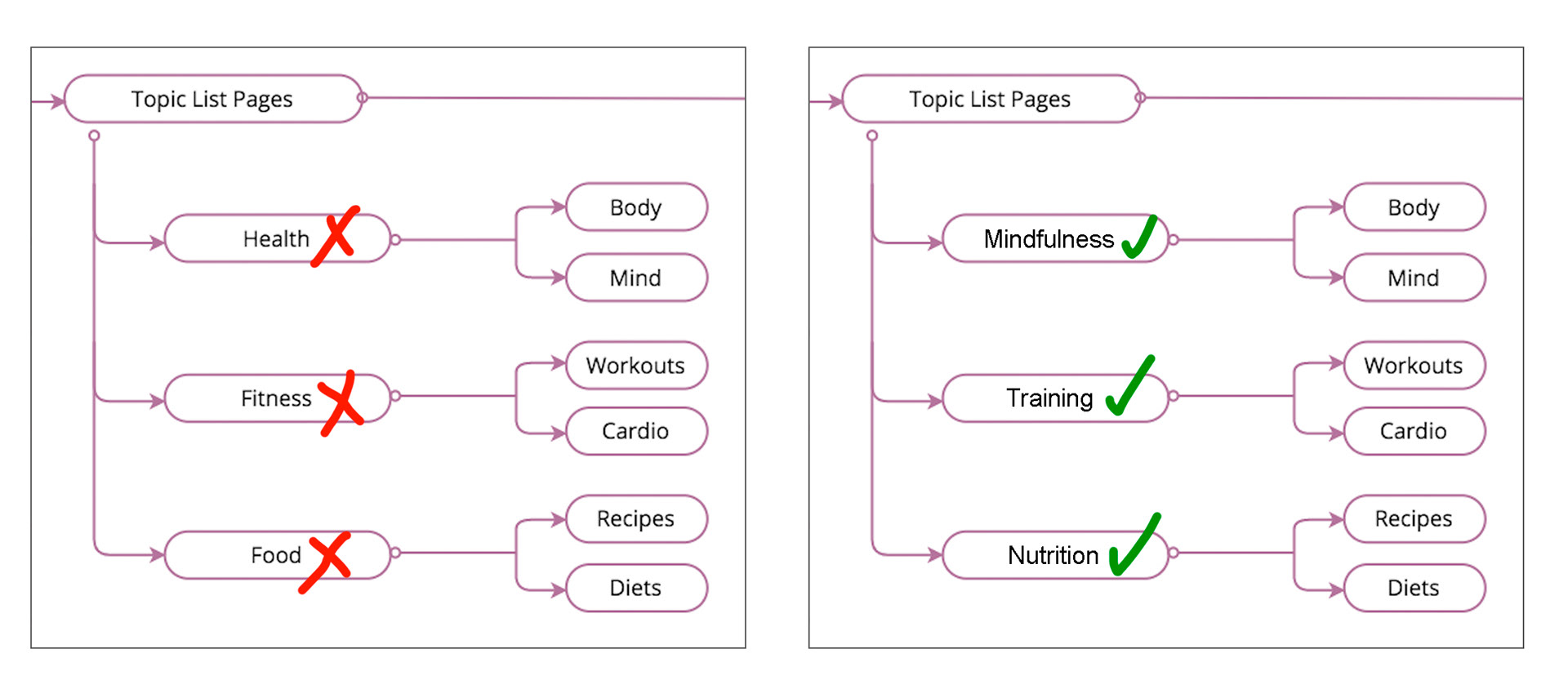
We had to cover a lot of categories and subcategories but also keep in mind how users group information. In the early stages of our content organisation we had labeled some categories HEALTH, FITNESS and FOOD, but after an Open Card Sorting exercise we discovered almost unanimously that TRAINING, NUTRITION and MINDFULNESS was prefered by the user. This was also later confirmed in Tree Testing and User Testing sessions.
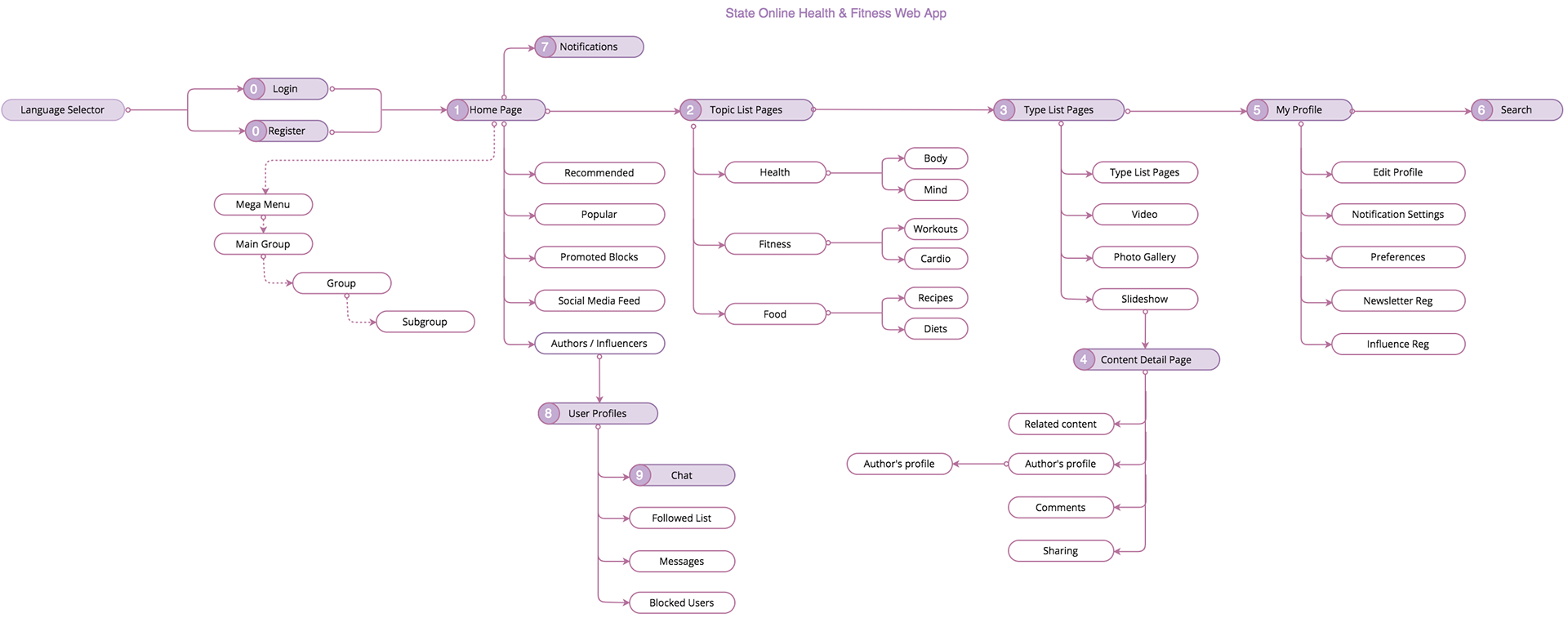
An Open Card Sorting exercise uncovered labelling issues. Tree Testing and User Testing also confirmed this.
Luckily we were able to iterate at this early stage and adjust the category names to better suit the mental model of the users and improve the representation of content.
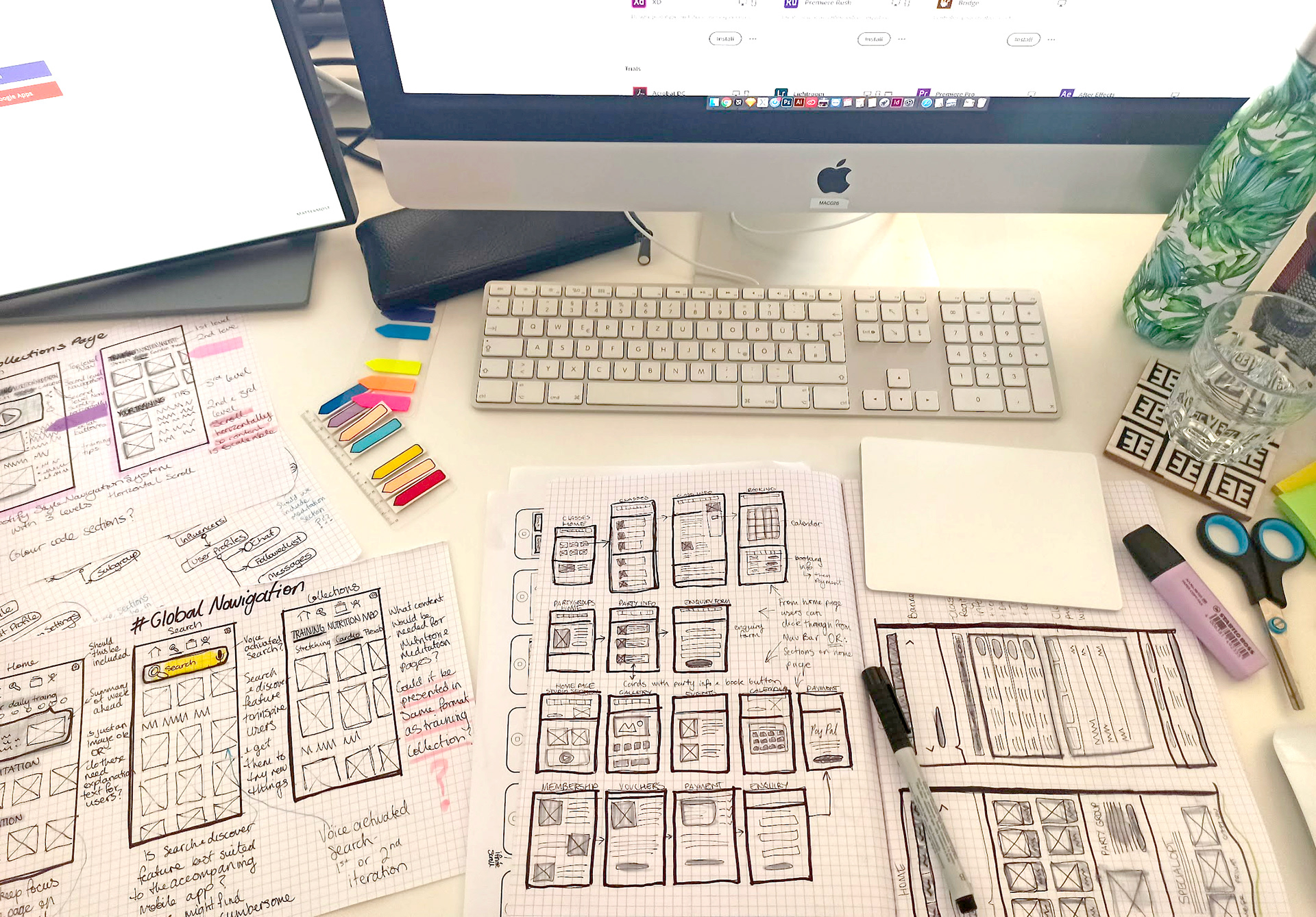
SKETCHING & WIREFRAMING
GOALS:
+ Organise and prioritise the content without overloading the screen.
+ Form the skeleton of the design by outlining features and formats without getting into fine detail.
+ Organise and prioritise the content without overloading the screen.
+ Form the skeleton of the design by outlining features and formats without getting into fine detail.
PROBLEM SOLVING:
In the early phase we tried to discover as many different ideas as possible by simply drawing them on paper as it was the easiest way of visualizing our ideas.
In the early phase we tried to discover as many different ideas as possible by simply drawing them on paper as it was the easiest way of visualizing our ideas.
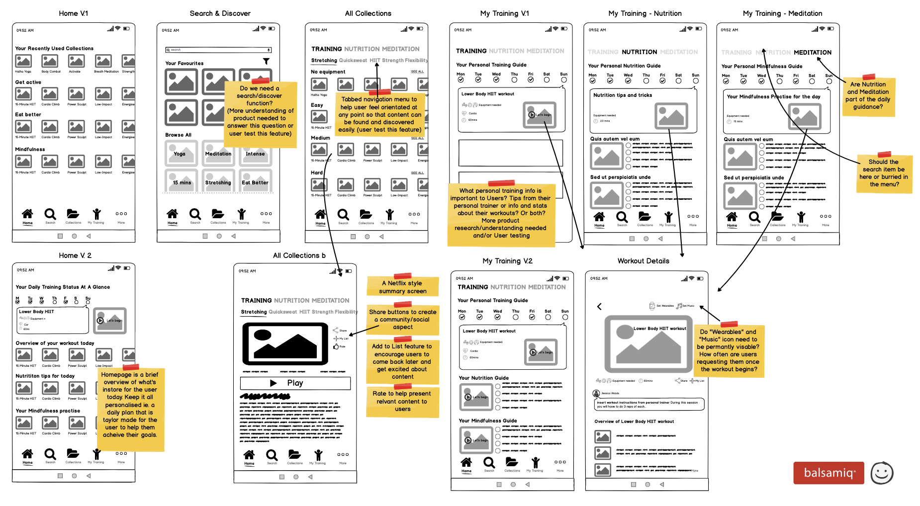
PROTOTYPING & TESTING
We defined solutions, created prototypes and tested them in many iterations.
ITERATIONS PHASES:
+ Simple interactive wireframe prototypes
+ Lo Fi interactive prototypes - user test
+ Hi Fi interactive prototypes - user test
+ Simple interactive wireframe prototypes
+ Lo Fi interactive prototypes - user test
+ Hi Fi interactive prototypes - user test
Fortunately some of our solutions failed and that’s how we knew what we had to change.
We had to come up with new ideas which at the end led to a better user experience.
After 4 weeks of iterating and user testing we had a pretty good idea of how the web app should work and help users achieve their goals.
VISUAL DESIGN
LOOK & FEEL
The final design was the result of several rounds of iterations and user testing, coming up with a design language that both worked with the existing branding, while allowing for expansion into a female market.
The final design was the result of several rounds of iterations and user testing, coming up with a design language that both worked with the existing branding, while allowing for expansion into a female market.
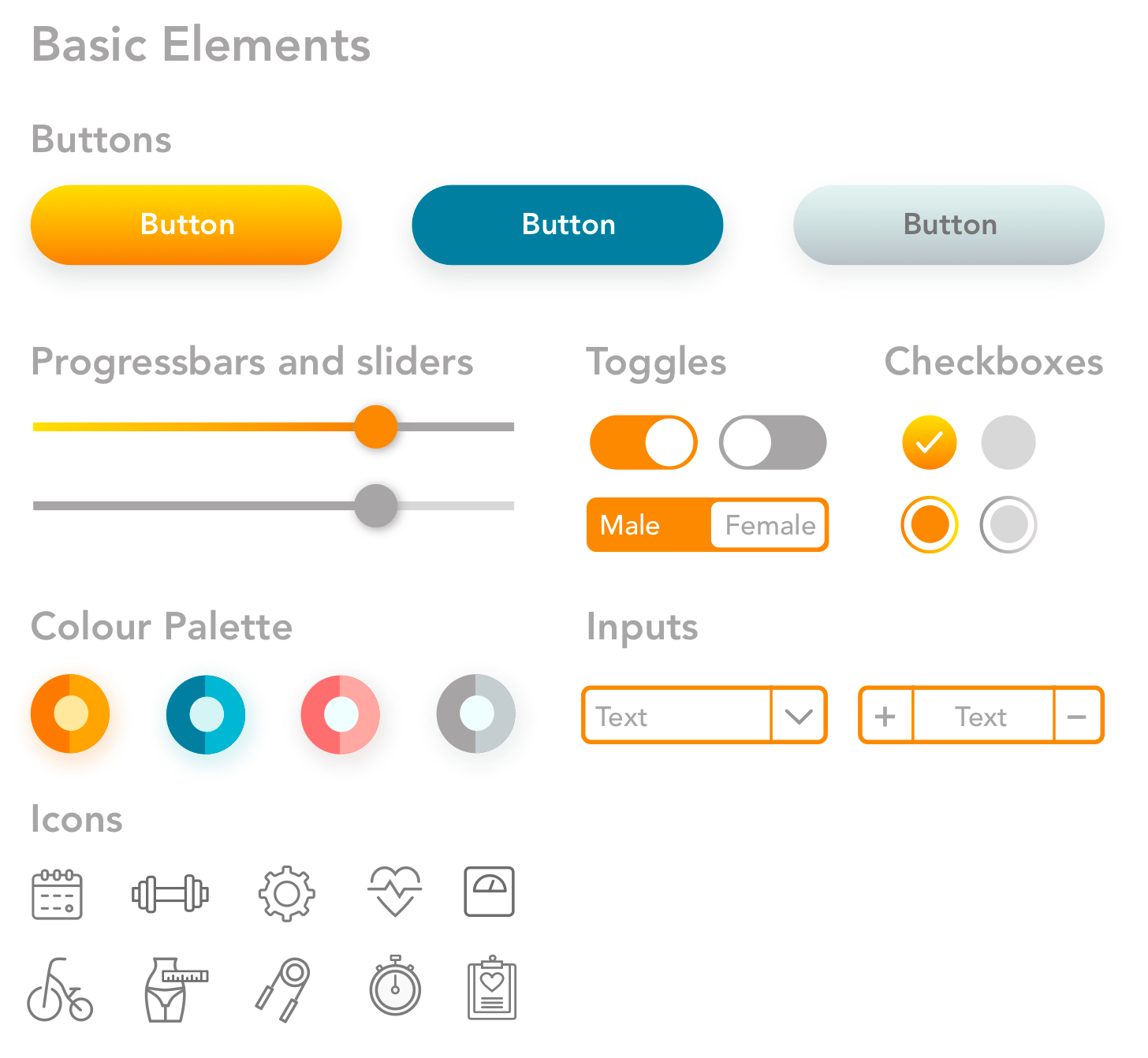
One of our biggest challenges here was to keep things consistent, so we set up a design system in order to have a unified set of rules and UI elements. With the system we could make sure there were no inconsistencies in the design.
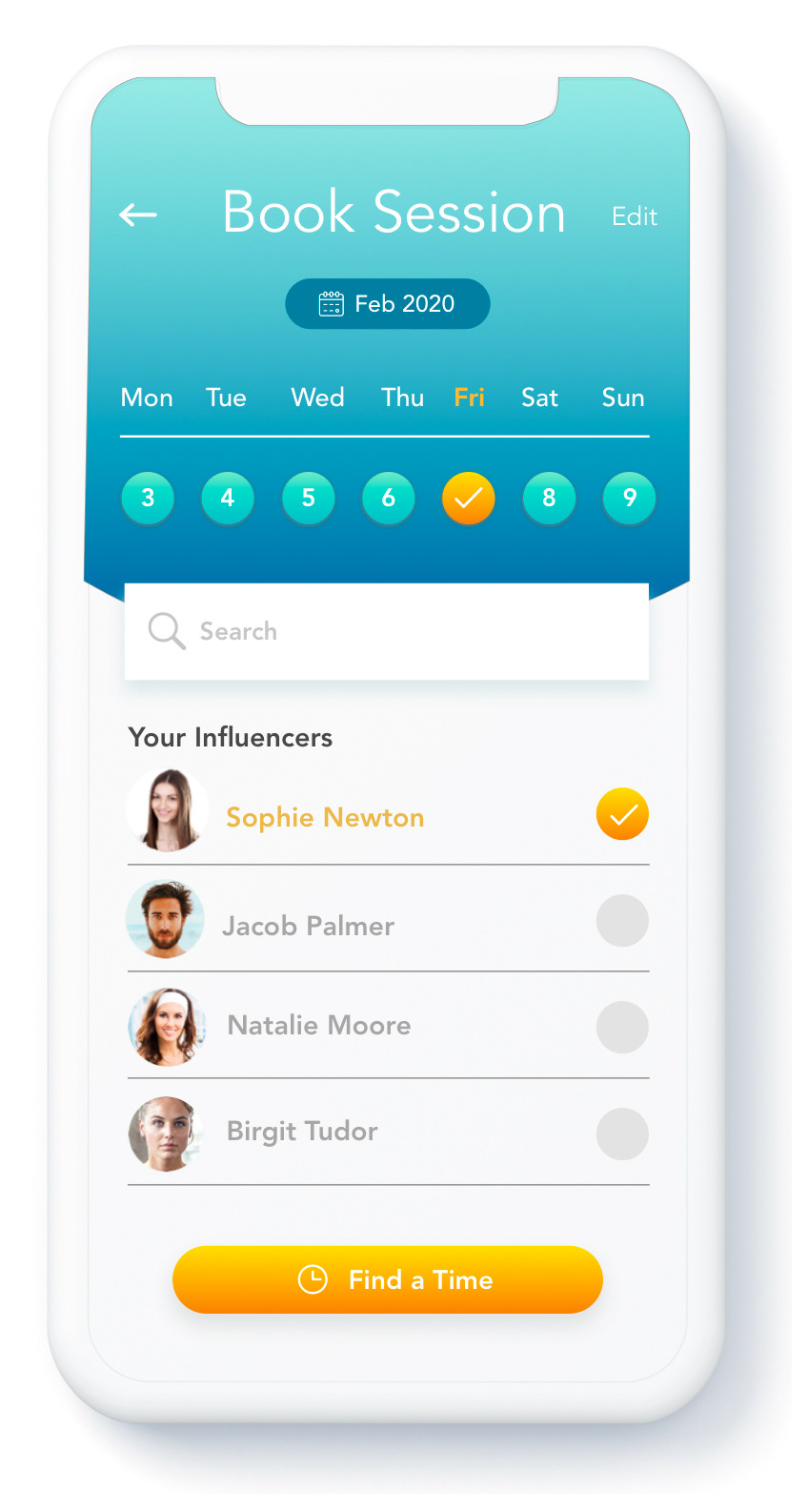
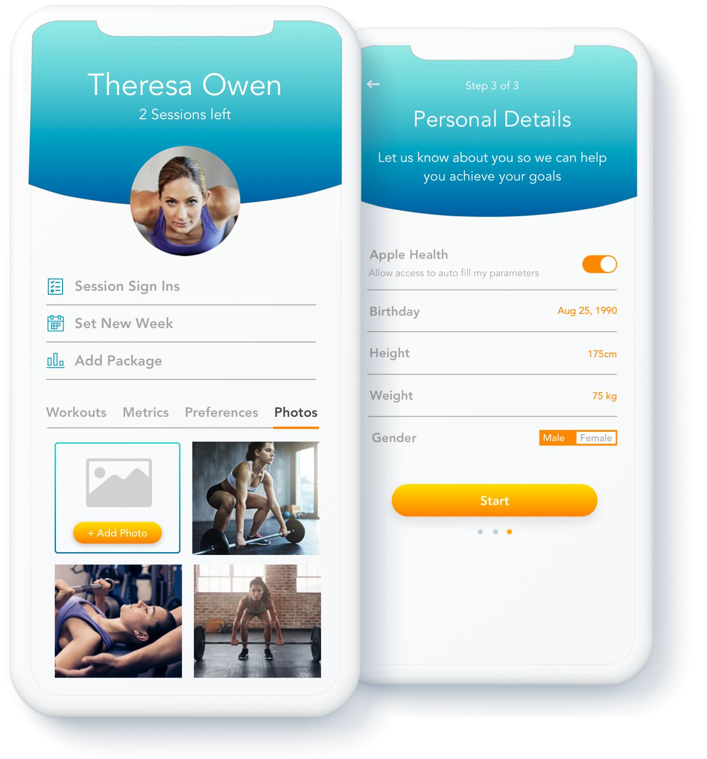
DETAILED UI SCREENS
We used Figma as our main design tool, since it was the easiest way for 2 designers to work together on the same thing at the same time. We found that Figma makes real-time collaboration easier than ever.
We used Figma as our main design tool, since it was the easiest way for 2 designers to work together on the same thing at the same time. We found that Figma makes real-time collaboration easier than ever.
DESIGNERS/DEVELOPERS COLLABORATION
SCRUM
For effective team collaboration we used an agile approach with a scrum framework which involved two-week sprints, planings, reviews and retrospectives.
For effective team collaboration we used an agile approach with a scrum framework which involved two-week sprints, planings, reviews and retrospectives.
DESIGN REVIEWS
To keep unity between developers and designers we had design review meetings on a weekly basis.
To keep unity between developers and designers we had design review meetings on a weekly basis.
QUALITY ASSURANCE
We had a quality assurance engineer to monitor and report issues on a Jira System.
We had a quality assurance engineer to monitor and report issues on a Jira System.